Three books stand out from the number published by the Spencer Family, as follows.
A download of these books (freely available on the web), will complete an advanced study of this extraordinary development in traditional European Copperplate.
Zebra Manga G Nickel nib.
Spencerian.php#ZebraGNickel
 Zebra G Nickel nib
$2.85 eachParcel code 0

|
Zebra Manga G Nickel coated, for a sharp, crisp line sketching nib.
Used for Copperplate it has a medium-stiff 'FEEL'. Selling for $2.85 each.
# The Zebra Manga G used mostly for its excellent
Manga Cartoon drawing & as a copperplaters nib. A large
nickel coated nib, that has been highly rated as the 'perfect'
Copperplaters nib, able to adapt to either fine or wide
strokes instantly, by the command of the experienced hand.
Nowadays, it will fit on some models of Fountain-Pens,
see the Osprey Zebra G pen above. Over time it will need replacing
as the nib wears out, or corrodes from fountain-ink.
For packs of 3x of this item - goto Zebra G 3x pack.
Sorry - we don't carry the Titanium version of this nib.
This nib was designed for dip-pen use, if you would like to use it "the old way", then goto our dip-pen handles webpage, for a range of handles to choose from (recommended: Tachikawa T-25).
Fountain Pen Angled/Elbow Handle.
Spencerian.php#FPEH
 Fountain-Pen Elbow Handle
$16.00 eachParcel code 1
|
Ornasonova's specially developed Fountain-Pen Angled/Elbow Handle. For right handed Spencerian/Copperplate users. This device makes a Fountain Pen with Zebra G nib, function just like a Dip-Pen with Elbow holder.
A great aid for Copperplate or Spencerian lettering enthusiasts, free up better writing ability with this angled handle, give the right "angle" expression to your broad & fine strokes. Selling for AUD$16.00 each.
For more information about this NEW item you can buy from us, see the paragraphs above, or read No.1 & 2 FAQ-Notes below.
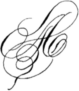
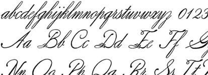
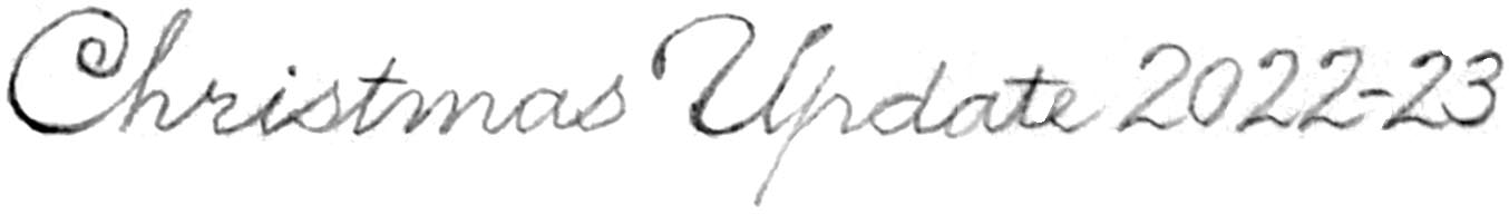
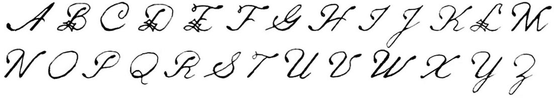
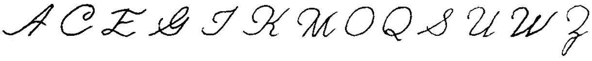
### ANNOUNCING A MODERN-SPENCERIAN FONT
, created from the handwritten lettering
shown on this webpage:
The ModernSpencerian.TTF font, is available to accompany the work on this webpage. It may help users in Microsoft Word type programs, to write quick letters & notes in Spencerian style. Its easy to read, without complex flourishing, or use the flourished capitals:
 ###
### To receive the ModernSpencerian TTF font, after payment, it will be EMAILED to your email-address. Simply click on the "Add to Cart" button & goto the checkout page. On receipt of your payment we will email you with the .TTF font file attached, in a .ZIP file. Payment is by Paypal's secure website, we just ask for your Email, Name & Address details for tax purposes, then you can pay by Paypal account or use Visa, Mastercard or Amex credit cards. For this single purchase from our website, THERE IS NO SHIPPING FEE.
|
|
FAQ-NOTES ABOUT THIS PAGES EQUIPMENT:
1. Fitting our Angled-Holder/handle to the John Neal fountain-pen.
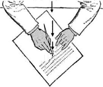
For the best copperplate results using the pen, it is to be fitted directly at its round-waisted finger grip area. It shouldn't be over tightened, but just until it holds firmly. At this position, (even with other brands of pen), it will be at the default position, that is, were the nibs point is in line with the main axis of the long black plastic handle, & not over-reaching that alignment to much. This provides a 'balance' position for the user to better gauge the nibs ink use on the page, by the pressure of nib-stroke.

2. The John Neal fountain-pen we sell with its fitted Zebra G nib, could be used for either Manga-cartoon styles of drawing or for Copperplate styles of lettering. The Angle-Handle is only used for Copperplate style lettering, as it aids the "Italic" angled writing used exclusively in these styles, for right-hand users only.
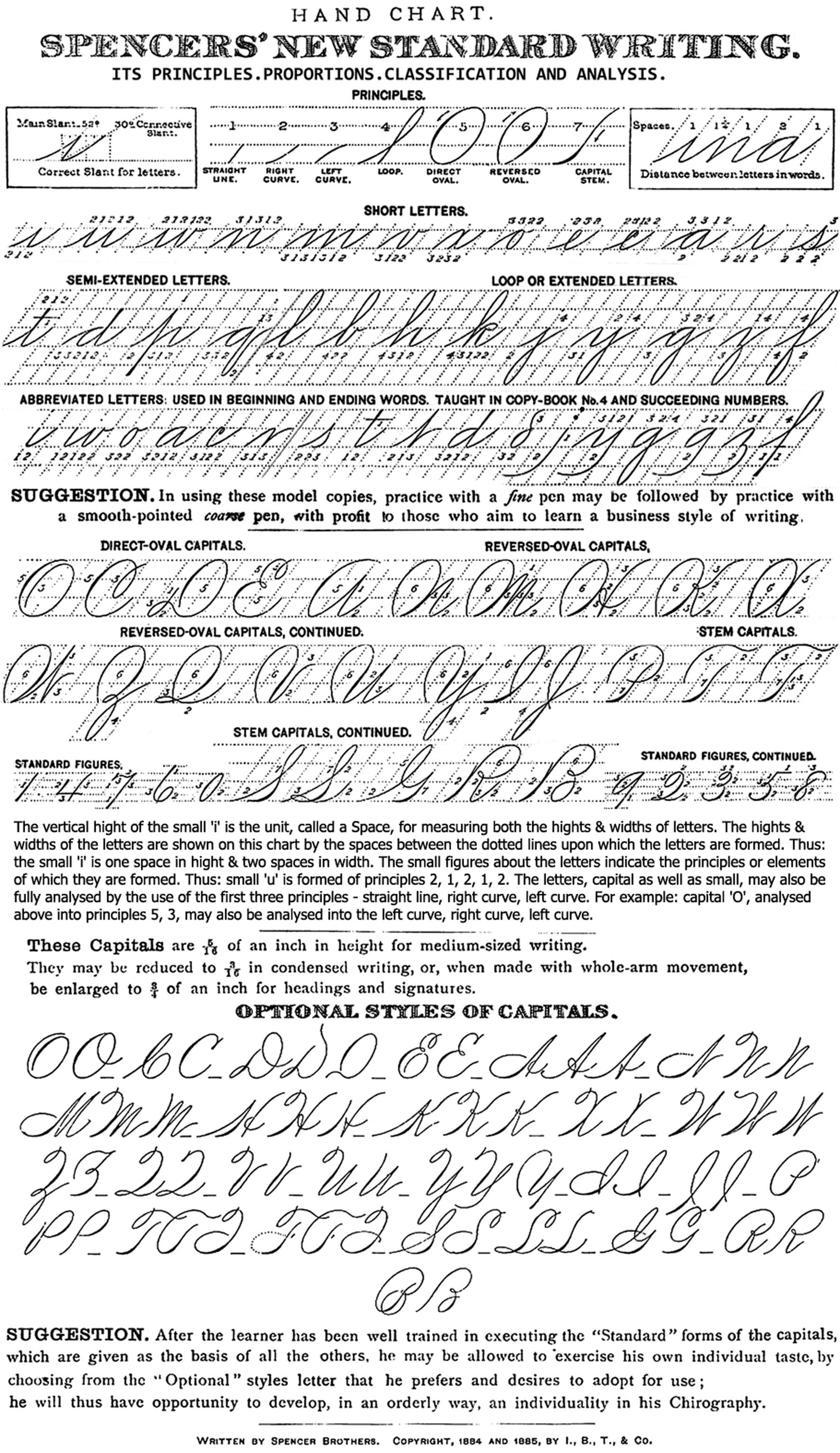
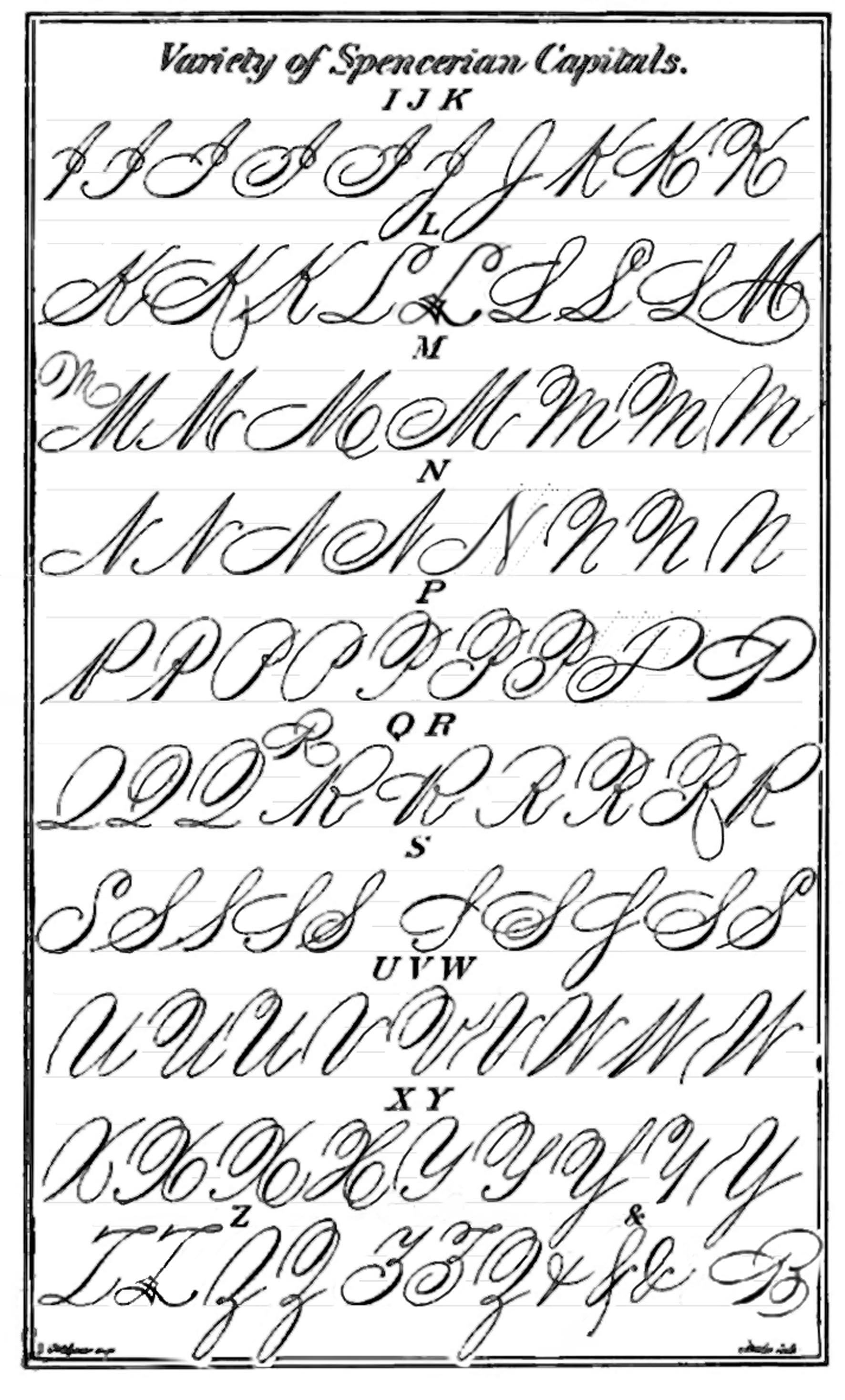
3. We have expanded this webpage with a Spencerian outline, so that users can learn this early American Copperplate & find the simplicity of its learning-curve. Copperplate, being the last of the 5 main European styles is often classed the most difficult to learn, as it involves what we call our modern handwriting, with more complex broad & thin strokes of the pen. The Spencerian style simplifies this complexity with its stages of development, as outlined by the original creator & source Mr P.R. Spencer & his sons. To go further than our thorough but brief outline, a number of publications from the Spencer family are available on the web, see a short-list of the books we chose.
4.
"Much - Much Easier". This is our catch phrase for the development of hand written Copperplate calligraphy.
Looking back to what started this joined letter, italic leaning style, it was originally done with a sharpened quill (feather). Hand shaped & trimmed, the feather was dipped frequently in ink, producing amazing results - for just a quill.
With the spring steel dip nib, the cutting feathers job became redundant, as every pointed nib was the same, & steel nibs held their springiness, better than a quill.
Fountain-pens made the writing job even easier, with modern handwriting making dipping pens a thing of the past. The loss of copperplate styling to handwriting was the problem, as the fine-art developed by this important style became neglected. Nowadays a small revolution has occurred, by careful choice of well structured copperplate nibs - being fitted onto fountain pens. Thus reviving the 'old' art style, with modern benefits.
Taking care of broad & fine strokes in a fountain pen, means its internal ink gully is carefully enlarged to allow both extremes of ink-flow use. Something good brands of fountain-pens have now done sucessfully.
But a feature of using the older 'dip pens' for Copperplate writing, gave rise to the "Angle-Elbow" holder, something a fountain pen cannot do!
Until our newly developed "Fountain-Pen Angled-Holder", which now allows the "Icing on the Cake". That is doing any Copperplate style of writing, taking advantage of the corrected lettering angle, by using this accessory. Made for right-handed writers only, as lefties naturally use the similar angle, without this handle.
So, "YES, COPPERPLATE WRITING IS NOW MUCH - MUCH EASIER".
Last minor update April 2023


 SPENCERIAN-COPPERPLATE CALLIGRAPHY GOODS.


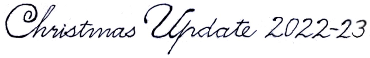

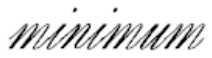 Written using the ModernSpencerian font.